The Illustrated Writer Man

Long ago, boys of a certain age — that would be 12 — would discover Ray Bradbury’s short stories. When Bradbury was a young writer, EC Comics adapted a couple of his stories without credit… or payment. What happened next is explained in this video.

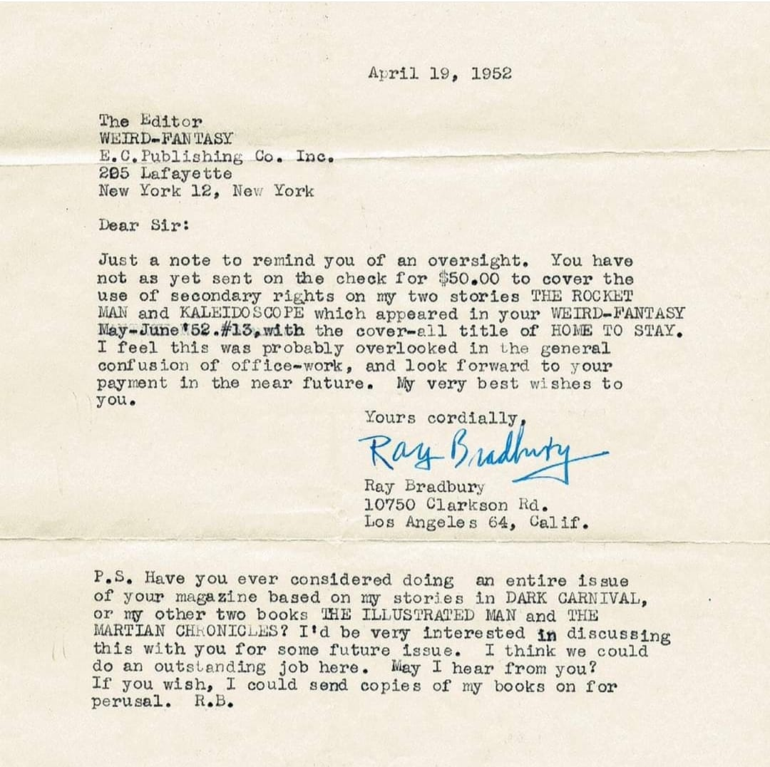
This is the famous, curiously friendly, letter that Bradbury sent to the EC offices.

Update: April 1, 2024. Ed Piskor, one of the voices in that video, has committed suicide. Not an April Fool joke.

https://www.cbr.com/ed-piskor-death-x-men/

Gaiman’s Giveaway

I have been Patreon-izing artist Colleen Doran for years. She is one of the entries in my Links list. Click the link and you will see Colleen’s most recent project with Neil Gaiman, illustrating his novel Chivalry, making it a graphic one.

Gaiman is auctioning off some of his worldly, fannish possessions. Some of the proceeds will go to The Hero Initiative, a comics-related charity.

All in Color for 12¢ – Part 2

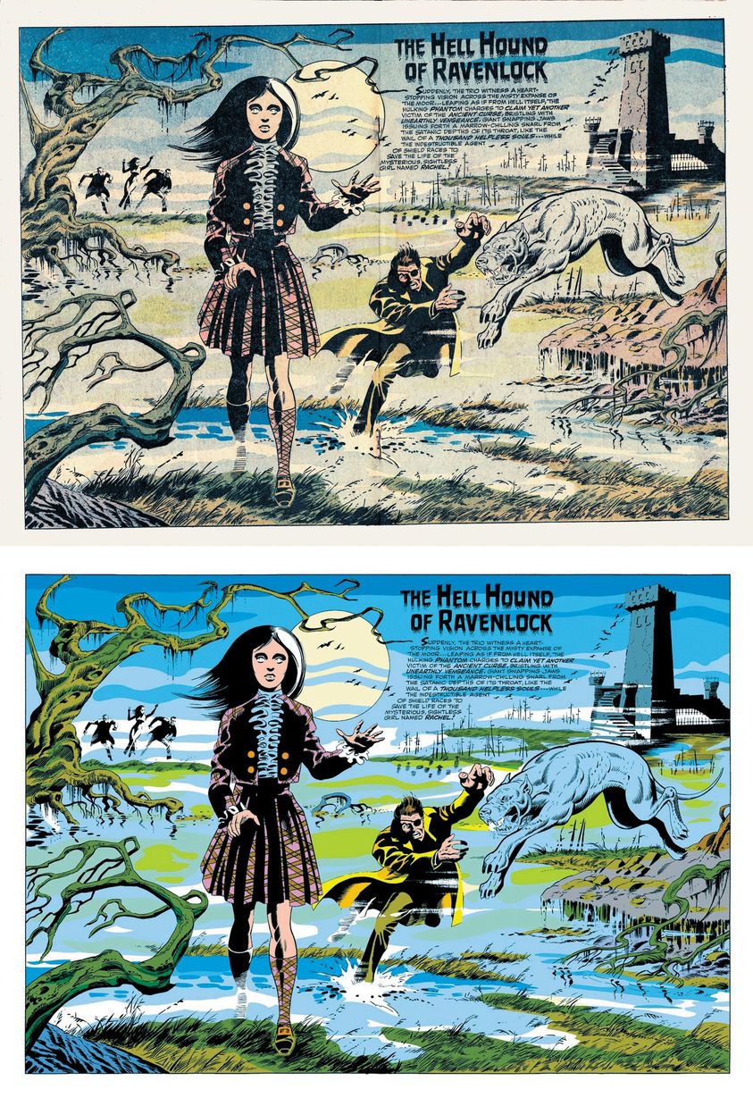
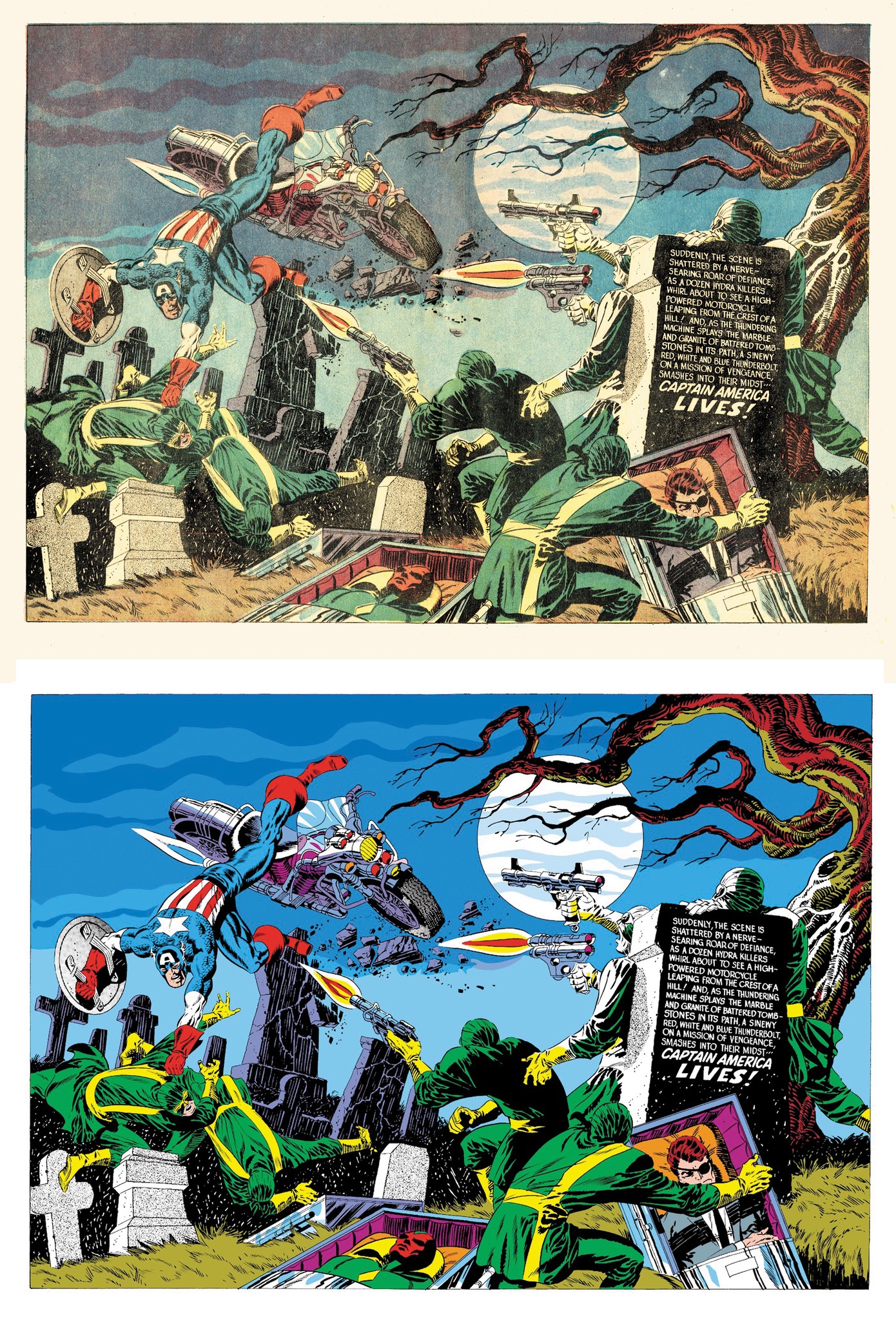
There is a dark side, literally, to digital comic book coloring. Having more colors to work with meant more finely shaded tones. But what looks great on a computer screen can appear muddy on the printed page. This video is about the opposite problem, with colors being too bright.

Chris at Comic Tropes apologizes to José Villarrubia for not crediting him as the source for some of the images he used. Here are a couple of Jim Steranko examples that José posted on Facebook.

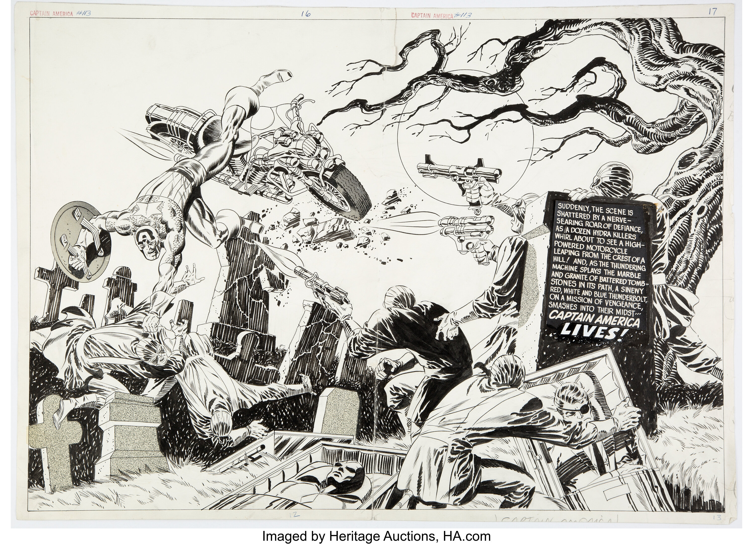
For this one I’m adding a Heritage Auctions image of the original art. Looking at it full size, you can see that most of the white lettering is a negative image made on a stat camera and pasted onto the art. In a past life I was proficient at stat camera and paste-up work. Never had a chance to try preparing color separations.

I’m not a fan of glossy paper for comic books. The Marvel Omnibus volumes are guilty of both overly bright colors and glossy paper, along with some poor restoration of linework.

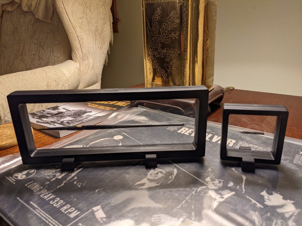
Comic book letterer Todd Klein has this view on the subject of coloring. Todd mentions his use of #3 Winsor-Newton Series 7 brushes, which was also Joe Sinnott’s favorite brush.

https://kleinletters.com/Blog/coloring-comics-old-school/

Winsor-Newton Series 7 #3 brush and Hunt 102 pen nib, from the Joe Sinnott estate.

All in Color for 12¢ – Part 1

The title is a nod to All in Color for a Dime, by Dick Lupoff and Don Thompson. Comic books haven’t cost 12¢ since 1969, but I am forever fond of my first few years being a fan.

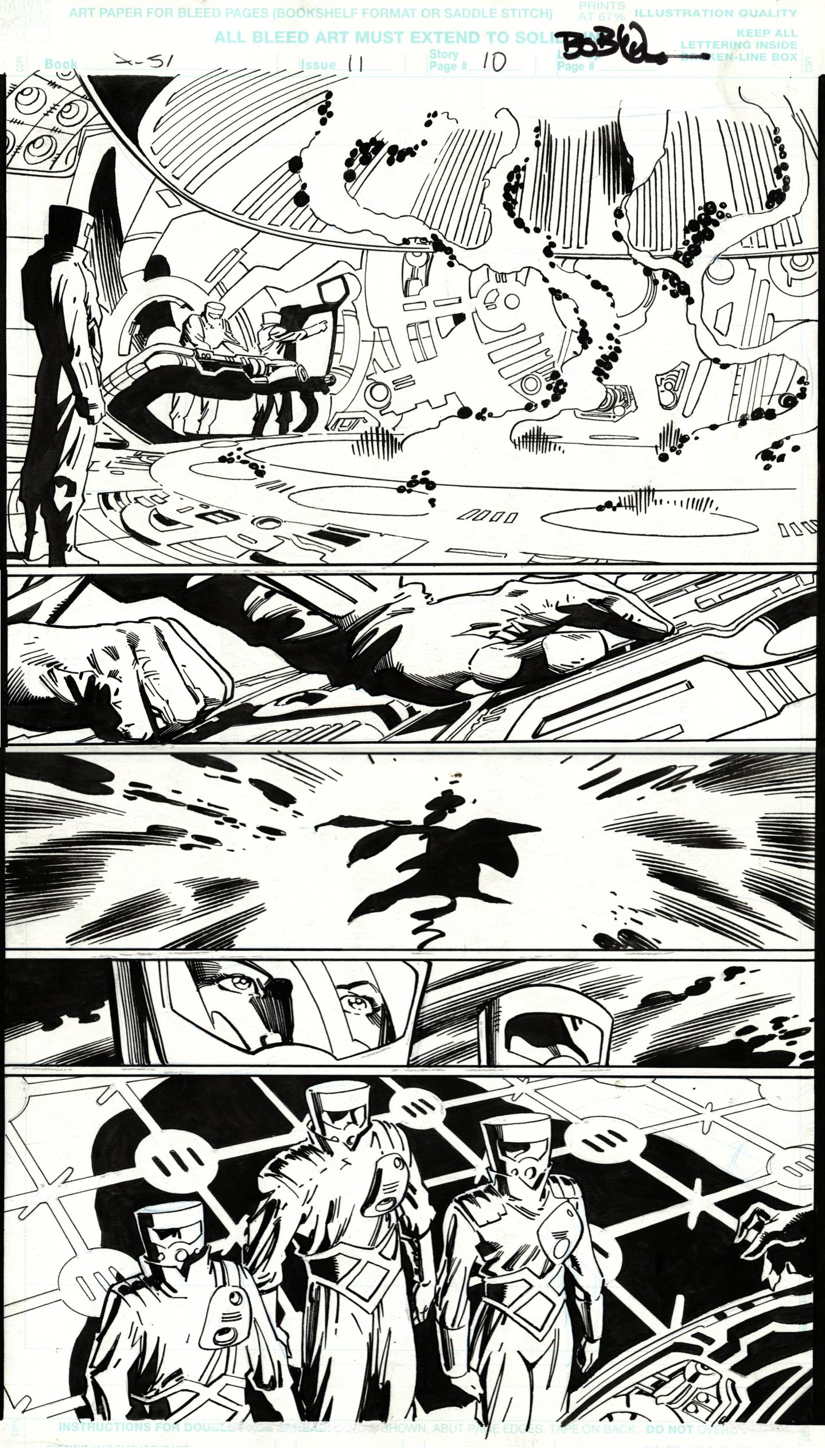
Bob Wiacek is a former comic book inker who received some of his training from Joe Sinnott. Here is an example of Bob’s work from the millennial year, 2000, on pencils by Joe Bennett.

X-51 #11 p.10

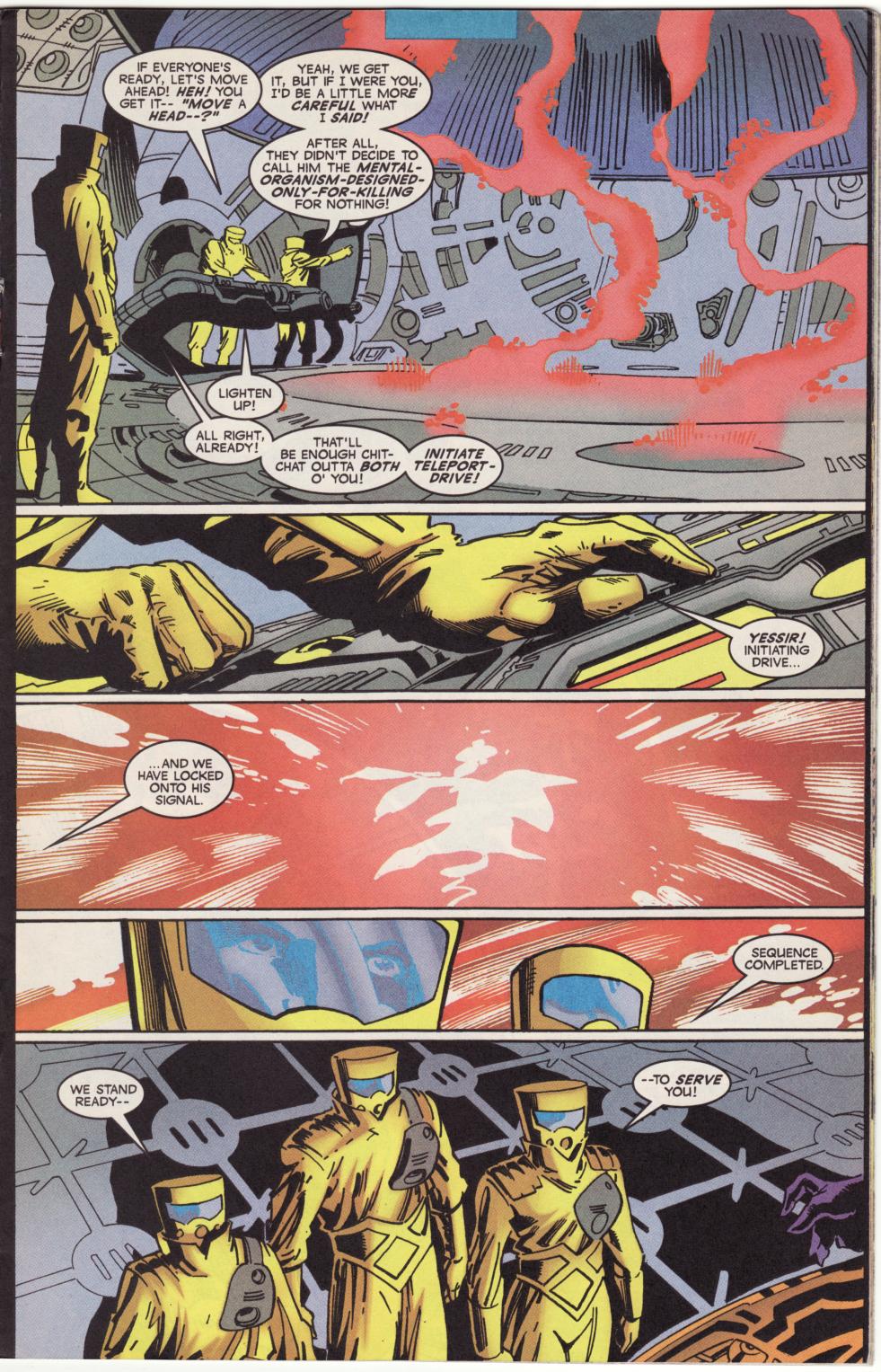
Here is how the page appeared in print, with very effective colors by Mark Bernardo. This is an excellent, and relatively early, example of digital coloring.

With the combination of quality paper and improved printing technology compared to the old days, the images come alive. Where digital colors, good paper, and perfect printing can go wrong will be the subject of Part 2.

Sorry to say, Wiacek is now legally blind from a medical problem. Bennett was reportedly released from Marvel for political reasons.

Murdoch Mysteries

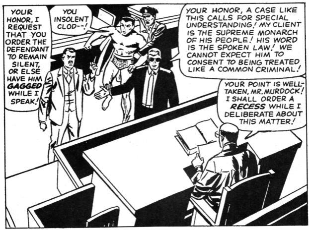
Trump attorney Joe Tacopina quits, and Matt Murdoch gets the nod, based on the argument he used in his courtroom defense of Prince Namor, the Sub-Mariner. Justice is blind, and so is the defendant’s lawyer!

Daredevil #7, page 10, panel 3. Art by Wally Wood.

It looks like the judge’s word balloon was originally going to be in the lower, left corner.